Lucenza

Lucenza

Lucenza

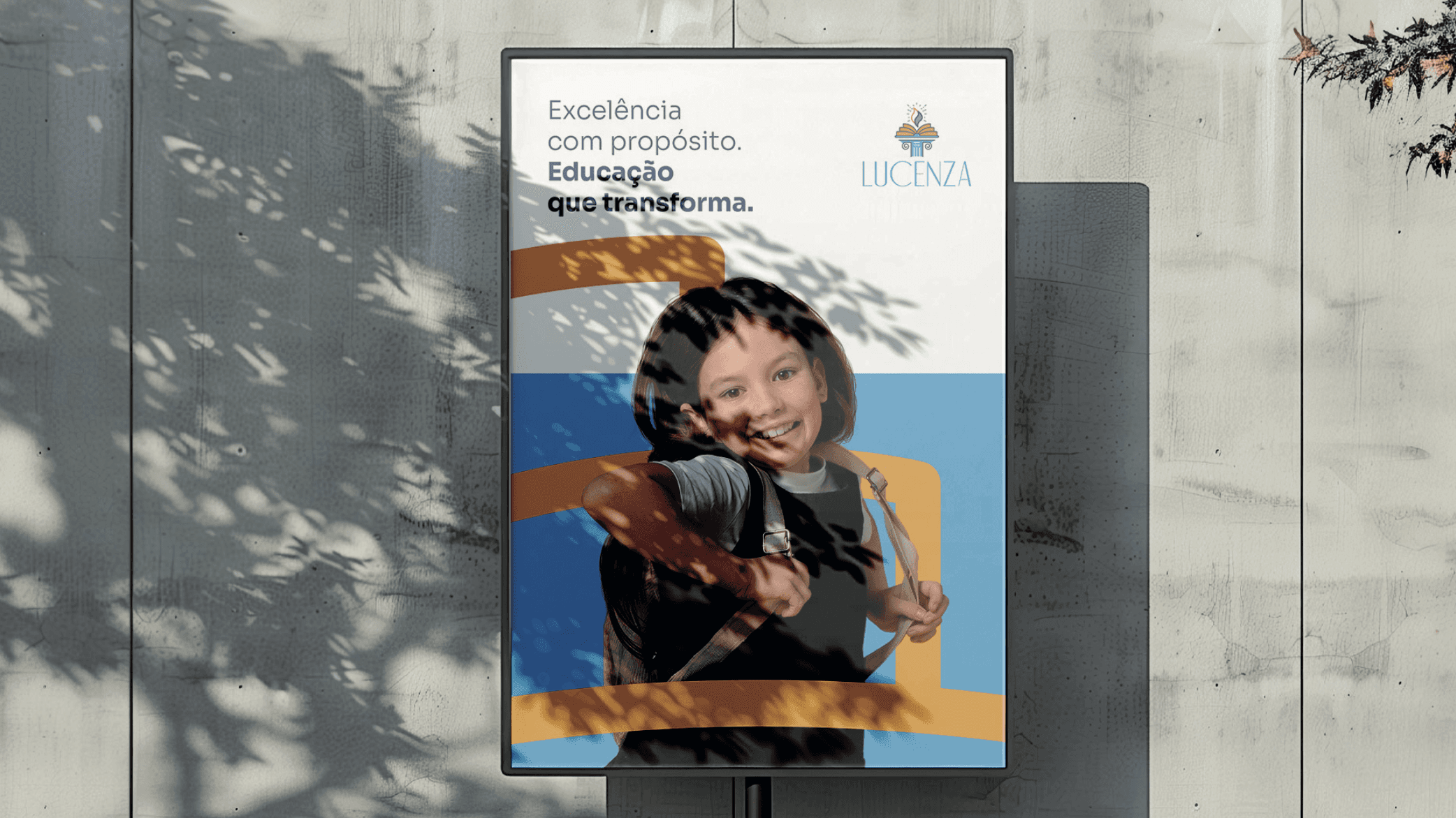
The Lucenza brand was built around the challenge of representing educational excellence, tradition, and future vision. The concept originates from the meaning of the name itself, associated with light and knowledge. The brand needed to communicate intellectual illumination, growth, and academic solidity in a timeless and inspiring way.

The Lucenza brand was built around the challenge of representing educational excellence, tradition, and future vision. The concept originates from the meaning of the name itself, associated with light and knowledge. The brand needed to communicate intellectual illumination, growth, and academic solidity in a timeless and inspiring way.

The Lucenza brand was built around the challenge of representing educational excellence, tradition, and future vision. The concept originates from the meaning of the name itself, associated with light and knowledge. The brand needed to communicate intellectual illumination, growth, and academic solidity in a timeless and inspiring way.

Man Smoking
Man Smoking

Year

2026

Client

Lucenza

Category

Branding

Product Duration

6 months
A Visual System Rooted in Meaning

The symbol combines an open book, a stylized flame, and a classical column. The book represents learning and the pursuit of knowledge; the flame symbolizes inspiration and transformation; and the column reinforces a solid foundation and tradition. The color palette balances gold, blue, green, and white, conveying knowledge, trust, and clarity. Applications demonstrate versatility while maintaining institutional elegance.

A Story Beyond the Logo

Lucenza carries a narrative of transformation through education. Every visual element was designed to support this story, connecting past, present, and future. The brand goes beyond identification, translating its purpose: to educate critical, ethical individuals prepared to evolve in a constantly changing world.

Knowledge Translated into Symbol

Abstract concepts like education, inspiration, and legacy are transformed into clear visual metaphors that communicate instantly and intuitively.

An Identity Built to Endure

The brand was crafted to remain timeless, avoiding trends while maintaining relevance across generations of students and educators.

  • More Works More Works

get in

touch

BASED IN Brazil

+55 54 9 9903.3132

DIgital Designer + UI/UX Designer

Based in the brazil, I blend design and digital art to create visual stories with purpose. Inspired by minimalism, sophisticated typography, and seamless user experiences, my work transforms simplicity into impactful design.

get in

touch

BASED IN Brazil

+55 54 9 9903.3132

DIgital Designer + UI/UX Designer

Based in the brazil, I blend design and digital art to create visual stories with purpose. Inspired by minimalism, sophisticated typography, and seamless user experiences, my work transforms simplicity into impactful design.

get in

touch

Based in the brazil, I blend design and digital art to create visual stories with purpose. Inspired by minimalism, sophisticated typography, and seamless user experiences, my work transforms simplicity into impactful design.

get in

touch

BASED IN Brazil

+55 54 9 9903.3132

DIgital Designer + UI/UX Designer

BASED IN USA, I AM AN INNOVATIVE DESIGNER AND DIGITAL ARTIST. MY PASSION FOR MINIMALIST AESTHETICS, ELEGANT TYPOGRAPHY, AND INTUITIVE DESIGN IS EVIDENT IN MY WORK.