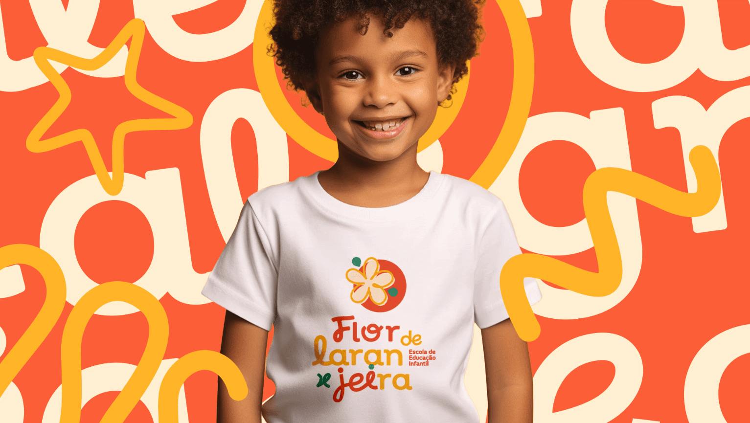
February 2, 2026

February 2, 2026

From Memory to Collective Identity

From Memory to Collective Identity

From Memory to Collective Identity

The main challenge of this project was transforming an intimate emotional memory into a collective identity capable of speaking to children, families, and educators. The founder’s childhood memory of picking oranges at her grandmother’s house became the emotional starting point for the concept. The work translated this personal experience into a playful, welcoming, and symbolic visual system that represents growth, care, and childhood development. The brand emerges as fertile ground where each child can bloom at their own pace.

The main challenge of this project was transforming an intimate emotional memory into a collective identity capable of speaking to children, families, and educators. The founder’s childhood memory of picking oranges at her grandmother’s house became the emotional starting point for the concept. The work translated this personal experience into a playful, welcoming, and symbolic visual system that represents growth, care, and childhood development. The brand emerges as fertile ground where each child can bloom at their own pace.

The main challenge of this project was transforming an intimate emotional memory into a collective identity capable of speaking to children, families, and educators. The founder’s childhood memory of picking oranges at her grandmother’s house became the emotional starting point for the concept. The work translated this personal experience into a playful, welcoming, and symbolic visual system that represents growth, care, and childhood development. The brand emerges as fertile ground where each child can bloom at their own pace.

Year

2025

Client

Flor de Laranjeira

Category

Branding

Product Duration

3 months
A Symbol That Blooms

The logo synthesizes flower and fruit into a single form, creating an easily recognizable symbol with strong emotional value. The flower represents delicacy, purity, and new beginnings, while the orange symbolizes energy, vitality, and nourishment. The organic, fluid typography reinforces warmth and proximity, moving away from the rigid institutional aesthetics common in the education sector. The result is an accessible, human, and memorable brand.

Color, Play, and Living Elements

The color palette was designed to stimulate positive emotions and create a vibrant, welcoming visual environment. Shades of orange, yellow, and green evoke joy, nature, and growth, balanced by softer tones that bring calm and safety. Doodle-inspired elements, based on children’s spontaneous drawings, expand the visual universe of the brand, adding movement, imagination, and creative freedom across both physical and digital applications.

  • More Works More Works

get in

touch

BASED IN Brazil

+55 54 9 9903.3132

DIgital Designer + UI/UX Designer

Based in the brazil, I blend design and digital art to create visual stories with purpose. Inspired by minimalism, sophisticated typography, and seamless user experiences, my work transforms simplicity into impactful design.

get in

touch

Based in the brazil, I blend design and digital art to create visual stories with purpose. Inspired by minimalism, sophisticated typography, and seamless user experiences, my work transforms simplicity into impactful design.

get in

touch

BASED IN Brazil

+55 54 9 9903.3132

DIgital Designer + UI/UX Designer

BASED IN USA, I AM AN INNOVATIVE DESIGNER AND DIGITAL ARTIST. MY PASSION FOR MINIMALIST AESTHETICS, ELEGANT TYPOGRAPHY, AND INTUITIVE DESIGN IS EVIDENT IN MY WORK.