Year
2025
Client
Corriglass
Category
Branding
Product Duration
3 - 4 Weeks
The visual identity uses parallel diagonal lines as its core element, directly referencing handrails, guardrails, and metal structures. The color palette combines blue, metallic gray, and white, balancing technical strength with visual lightness. Patterns derived from the icon expand the graphic system, ensuring consistency, rhythm, and recognition across both physical and digital applications.
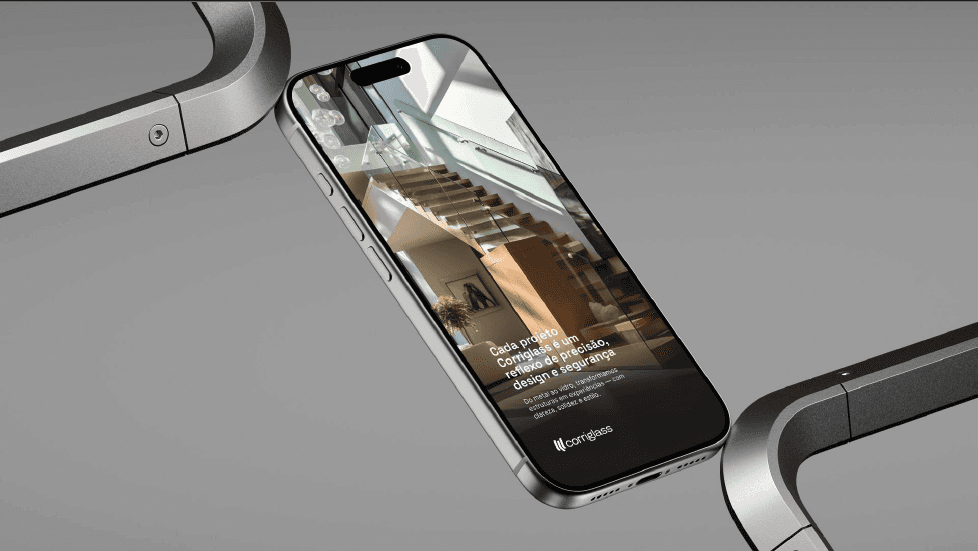
The new website was designed to simplify the user journey, allowing visitors to quickly find the right solutions. Information architecture prioritizes clarity, with well-structured content and service-oriented navigation. Real project photography takes center stage, conveying trust, quality, and sophistication, while the clean layout reinforces a smooth, objective user experience.
The visual system balances technical precision with a refined aesthetic, elevating an industrial brand into a contemporary, design-driven presence.
From digital interfaces to physical materials, the brand system ensures coherence, reinforcing trust and professionalism at every interaction.